
Mr. K.C. Kailasam - 28 Jul 2026
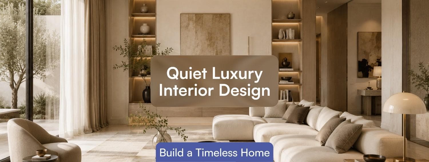
Quiet Luxury Gets Reduced to a Color Palette. Ask ten people to describe quiet luxury interior design and most will say the same thing: beige, linen, no logos. That detail explains why so many homes that chase the look end up feeling expensive but forgettable, a beige box with good lighting. Quiet luxury was never about the absence of color. It is about the absence of anything in the room that exists purely to announce cost, replaced entirely by decisions you feel rather than notice: proportion, material honesty, and how a joint is finished where two surfaces meet.
We say this after building enough homes to watch the difference in real time. Two clients can specify nearly identical material lists, same stone, same palette, same brass hardware, and end up with completely different rooms, because one project got the execution details right and the other did not. This guide covers what actually separates the two.
Minimalism is about removing things. Quiet luxury is about what remains being unmistakably well made. A minimalist room and a quiet luxury room can look identical in a photograph and feel completely different standing inside them, because the second one is doing more work with fewer visible elements: a door that closes without a sound, a countertop edge that is eased rather than sharp, skirting that sits flush instead of proud of the wall.
This is the distinction we design around in our home interior design projects, where the brief is rarely "make it look expensive" and almost always "make it feel calm and considered," which is a materials and execution problem, not a decorating one.
Four materials do most of the work in a genuine quiet luxury interior: natural stone with visible, unpolished movement, limewash or lime plaster on walls, timber left close to its natural finish, and metal in matte or brushed tones rather than high-gloss chrome. What connects all four is that they age. A polished, uniform surface looks the same on day one and day one thousand, which is precisely why it reads as artificial. Stone with veining, plaster with tonal variation, and timber that develops a patina all continue to look considered as they wear, which is the opposite of most budget finishes.
There is a genuine financial argument for this, not just an aesthetic one. Houzz's 2026 Renovation Plans Report found that 62 percent of homeowners expect to stay in their current home for eleven years or more, which is exactly why paying more upfront for a material that improves with age, rather than one that needs replacing in five, is a rational decision and not an indulgence.
We go deeper into how these material choices translate across different home styles in our guide to interior design styles for luxury homes in South India, which is worth reading alongside this piece if you are still deciding on a direction.
Almost never in the material selection. Nearly every client who comes to us with a quiet luxury brief has already picked a reasonable palette off Pinterest. The failure point is execution: limewash applied in a single flat coat instead of layered to create depth, stone slabs bookmatched carelessly so the veining does not line up across a seam, or hardware mixed across two slightly different finishes of brass because two different vendors supplied them. None of these mistakes show up on a mood board. All of them are immediately visible in the finished room, and none are cheap to fix after installation. This is why choosing the right interior design company in Coimbatore matters, particularly for projects where material selection, sourcing and execution need to work together from the beginning.
A related mistake is sourcing the same material from multiple batches without checking consistency. Natural stone, in particular, varies slab to slab, and a kitchen island cut from one batch next to a countertop cut from another can show a visible mismatch in tone that no amount of good lighting design will hide. This is a sourcing and sequencing problem, decided weeks before installation, not something a site team can correct once tiles are already laid. The other recurring mistake is treating quiet luxury as a style you apply at the end, choosing calm colors and quality materials after the layout is already fixed. The proportion of a room, not its palette, is what determines whether it reads as considered or simply plain.
A high ceiling with a single well-placed pendant reads as more luxurious than a lower ceiling with five recessed spotlights, regardless of what either room is finished in. Quiet luxury depends on restraint in the layout itself: fewer, larger openings instead of many small ones, joinery that conceals rather than displays storage, and lighting layered across at least three sources, ambient, task and accent, instead of a single flat wash from the ceiling. Get this wrong and no amount of correct material selection recovers it, because the eye reads proportion before it reads finish.
Door and window proportions matter more than most clients expect walking in. A door sized correctly for the wall it sits in disappears into the room, while an off-proportion door, even by a few inches, draws attention exactly where a quiet luxury interior is trying not to. This is one of the few details that has to be resolved during the working drawings stage, since it is effectively impossible to correct once the frame is set.
This is easier to judge in person than from a rendering, which is why we encourage clients to walk through finished material and lighting setups at our experience center before finalizing a material palette.
Design coverage through 2026 has been blunt about this: quiet luxury, as a headline trend, peaked in 2024 and 2025, and search interest is shifting toward bolder, more personal aesthetics.
What that shift actually means, though, is not that quiet luxury has become dated. It means its core principles, material honesty, restraint, and craftsmanship over branding, have become the foundation other trends are now layered on top of, rather than a complete look on their own. Pinterest's own audience data shows roughly 70 percent of its luxury-focused users are under 35, a generation that has grown up skeptical of visible logos and ornate traditional luxury to begin with. For that audience, quiet luxury was never a passing aesthetic. It is closer to a baseline expectation that other, more expressive layers now get added to, not replaced.
Fix the material palette and the lighting plan before you look at a single piece of furniture. Choose no more than three primary materials, one stone, one timber tone, one metal finish, and hold every room to that palette, since inconsistency across rooms is what makes a large home feel unplanned rather than restrained. Confirm who is executing the finished work directly, since the gap between a good and a poor limewash application is entirely down to the applicator, not the product.
If you want the design, procurement and execution held to one accountable team instead of coordinating separate vendors yourself, our turnkey interior design service is built around exactly that kind of finish-critical project.
No. Minimalism is defined by how little is in a room. Quiet luxury is defined by the quality and honesty of what remains, and a quiet luxury room can include more furniture and detail than a strictly minimalist one.
The materials typically cost more upfront than budget alternatives, but they are chosen specifically because they last longer and age well, which is a different calculation than paying more for a trend that will need replacing.
Warm neutrals, off-whites, stone tones and muted earth colors dominate, but the palette matters less than the materials carrying it. The same beige painted flat versus applied as layered lime plaster reads completely differently.
Yes, and arguably better than in a large home, since a smaller space makes proportion and material consistency errors more visible, and a restrained palette makes a compact layout feel calmer rather than cramped.
Quiet luxury rewards patience more than budget. The rooms that succeed are the ones where proportion was decided before materials, and materials were installed by people who understood why a single flat coat of limewash can undo the entire effect. For homeowners looking for the best interior designers in Coimbatore, the same principle applies: good design depends as much on execution, material selection and attention to detail as it does on the initial concept.